The styles you find in apps on your phone have changed drastically over the years, and yet somehow many of them have similar qualities. So what is the “in” look these days? We asked our UI/UX designer, Kristen Vogler, to come up with a list of what she thinks are the top ten mobile app design trends of 2017.
1. Virtual and Augmented Reality
There has been talk of VR/AR for years and 2017 has finally delivered what we have been waiting for. With Apple’s announcement of their support of VR/AR features, we will only see more apps hitting our phones. This phenomenon is definitely creating a multitude of new opportunities for product designers who are looking to upgrade what they currently have. Curiscope found a unique way to combine both VR and AR with their Virtuali-Tee, a t-shirt/app pairing that allows users to see the anatomy of their torso.
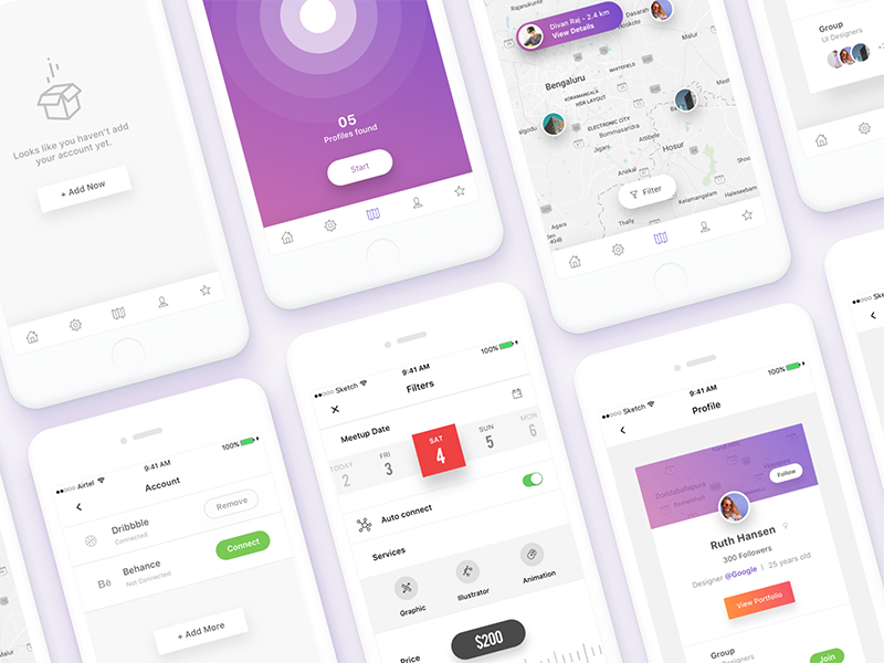
Image from Divan Raj
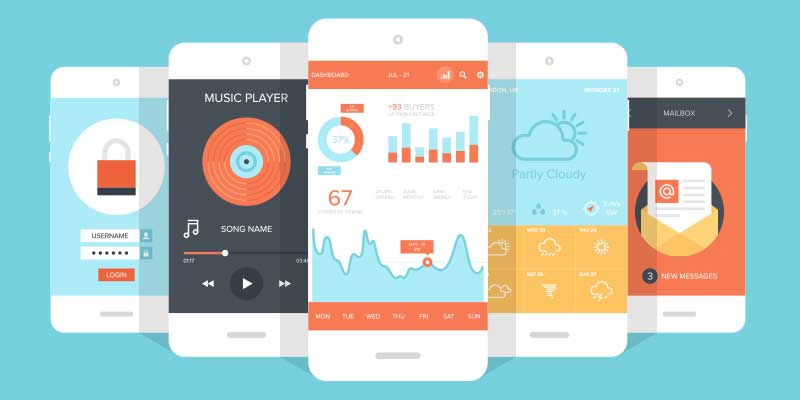
2. Simplicity
Our eyes are the biggest beneficiaries of clean and simple designs seen through most apps. This idea suggests we stop distracting users with overly stimulating graphics and pay more attention to content. It also proves the need for whitespace (the empty margins around content) in app design. While whitespace does not actually need to be white, it allows our eyes a much needed rest from the text and graphics we scroll through all day.
Image from Ramotion
3. Animation
Animation brings a quality appearance and when used correctly, it can communicate the reasoning behind features and functionality. Use it in situations to highlight completed actions, or even to load content in a unique way. The goal should always be to immerse the user in the experience, and use animation to entertain in a logical way.
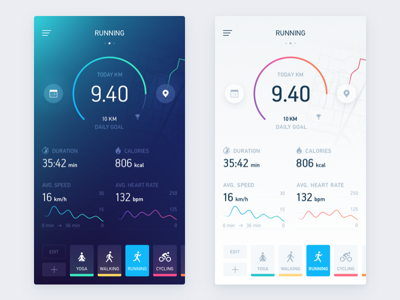
Image from Radmir Mingaliev
4. Color Diversity
While clean and calming colors is not a new trend, the scheme is still going strong and not going anywhere anytime soon. There is also a new iteration to this palette, still employing a clean look but with a key difference. Dark contrasted with vibrant colors. You may notice many pieces of software offer a dark and light view. This is no different than the color palettes popping up in mobile app design.
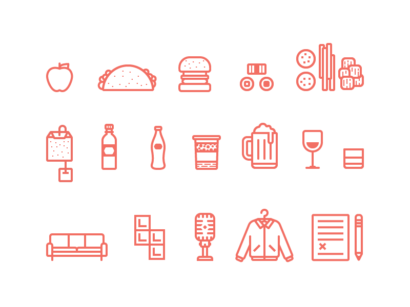
Image from Ryan Putnam
5. Icons
The look of icons has been transforming every year. Starting with the popular 3D button design, moving towards a flat design, and then moving towards a bolder outline style. Now we see the bolder lines slowly evolving in more and more apps to a thinner, minimalistic approach. In addition to thinner lines you may start to see more icons incorporating animation when they are part of a user action.
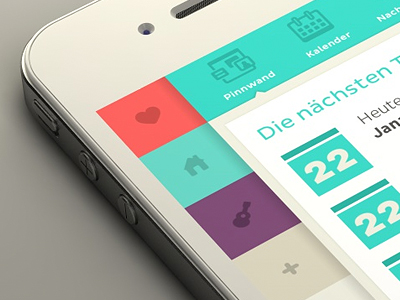
Image from Riccardo Carlet
6. Goodbye Hamburger
There is a growing consensus among designers that the hamburger menu (those horizontal lines indicating navigation options) just doesn’t work. It’s used so often because there is a lack of better options. Enter Priority Navigation. On websites the idea is to reveal more navigation options as the screen gets bigger, meaning you need to decide the order of your navigation based on highest priority, The Guardian and SB Nation are examples of this. But how does that carry over into mobile apps? Quite simply it forces designers to be more intuitive about the experience each page is providing. What are the basic interactions for each page? Can navigation be incorporated into gestures? Built into small actions? It’s the job of app designers to figure it out.
See more from LukeW
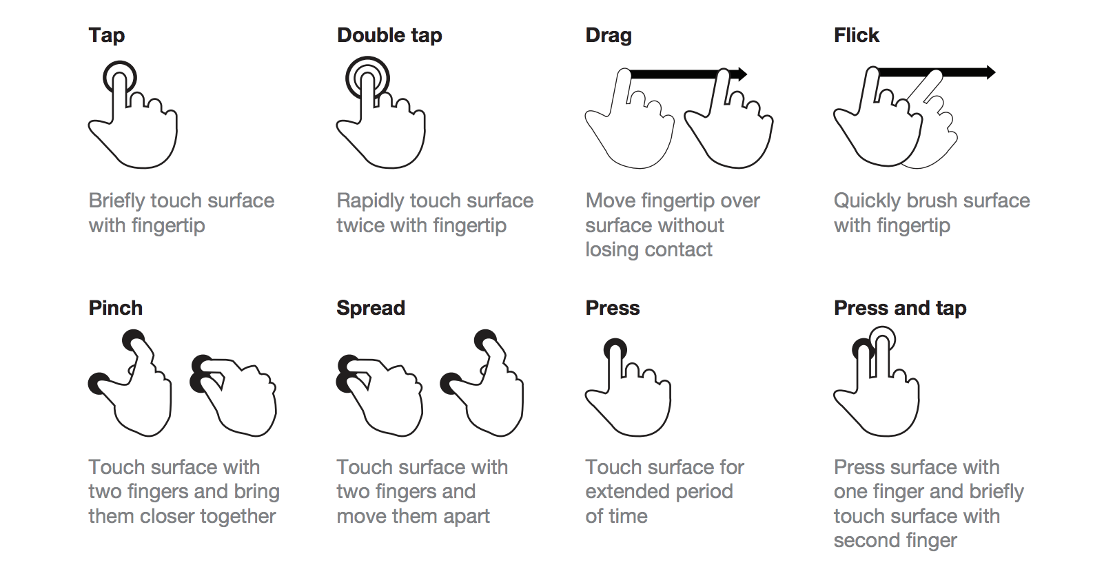
7. Gestures over Buttons
Gestures offer a great way of navigating through pages without the use of buttons. The only reason we don’t see them more often is the lack of uniformity. By now we know tapping a gear icon will usually bring us to a settings menu. However a two-finger swipe can do completely different things between one app and another. Still, we are starting to see more and more apps employing basic gestures for zooming into content or deleting an item, and this will only grow as standards are created.
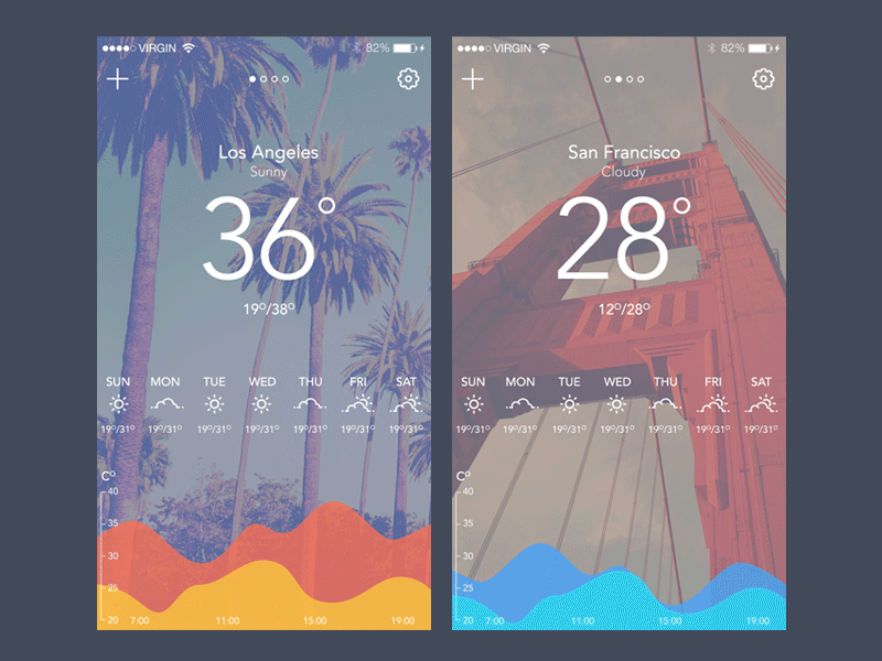
Image from Virgil Pana
8. Diffused Backgrounds
Using large images as a background brings a unique touch to your mobile app but it can also present a problem when overlaying it with content. That is where diffusing comes in. You may have noticed the trend in your own apps, background images appear to be washed out, or have a duller gray tone. That is the diffused effect, allowing the common white or black text to appear more vividly on top without losing the style a background image supplies.
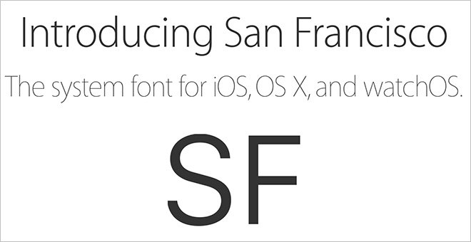
Image from Apple
9. Typography
Typography took a bit of backseat in recent years to color and navigation, however it should be coming back in full force. Apple started a movement for scalable typography with it’s release of iOS 7 and the typeface Helvetica Neue and continued with it’s most recent addition, San Francisco, a typeface designed with the Apple Watch in mind. The goal is to use a single typeface with clearly defined letters that can be read with ease, no matter the size. That may seem like an easy task but add in the caveat of a pleasing style and it becomes much harder. Designers need to put in the extra time to test the fonts they want to use in apps in a range of sizes and colors.
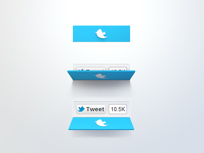
Image from Erik Deiner
10. Social Media Buttons
It’s not new news, social media apps are part of our everyday lives and more and more companies are integrating their functionality. Apps seem incomplete without social media buttons, it has become an expectation. Whatever the app is for, business, game, eCommerce, etc. there will be social media buttons on the screen. For apps that require a login, we are also seeing more integration with social networks, the ability to generate an account quickly using a social media account is becoming more and more common place.
Have an idea? Turn Your Vision into Reality
About Agilx
Agilx is a software development firm located in The Haymarket in Lincoln, NE. Agilx builds custom software for startups, medium size business and enterprise clients around the world. The team is committed to providing the best experience for it clients throughout the entire software development lifecycle. Can your company benefit from developing custom software to automate process and improve your bottom line? We would love to hear from you, feel free to call or email us at any time. 402-817-4313 or support@agilx.com. www.agilx.com